
A speculative HR mobile concept designed to reduce support tickets and increase employee independence for a multi-generational, multilingual workforce.
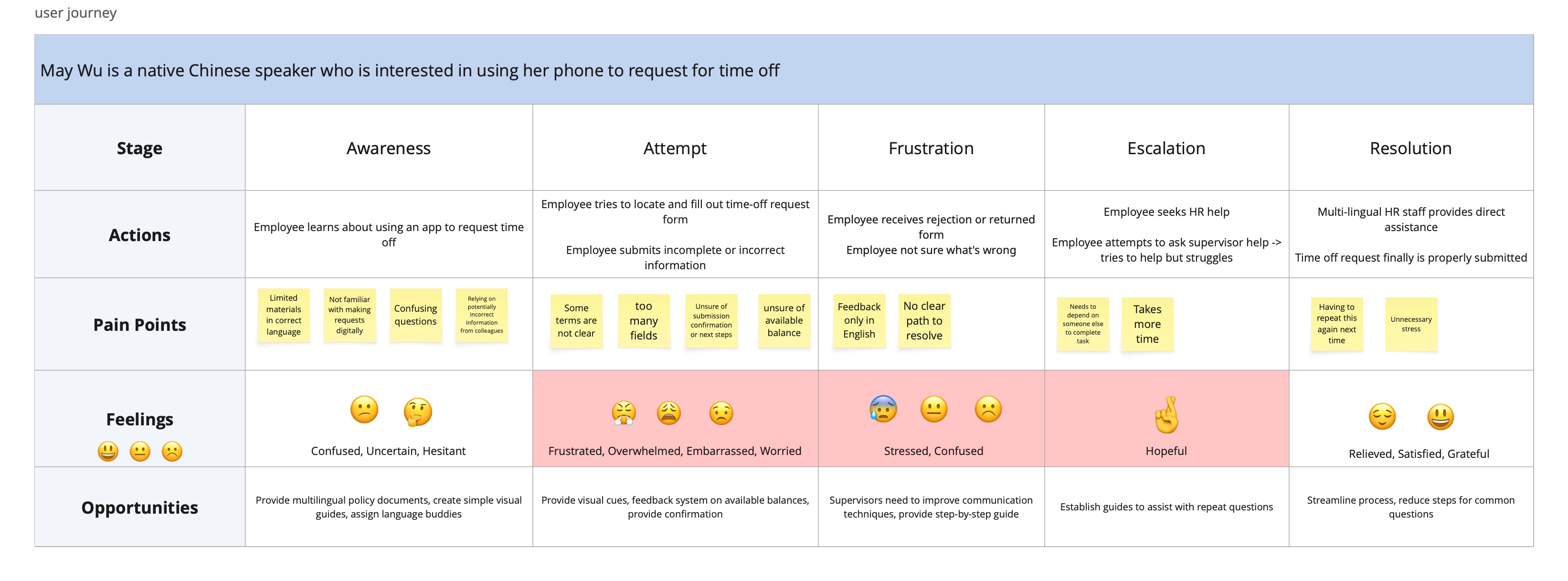
As an HR Coordinator, I am the first person employees turn to when they are frustrated. I watched daily as employees, who are mostly 50+ and non-native English speakers, struggled with software that was frustrating and difficult to use. This project was born from those daily observations. I realized the barrier wasn't a lack of employee interest—it was a lack of accessible design.
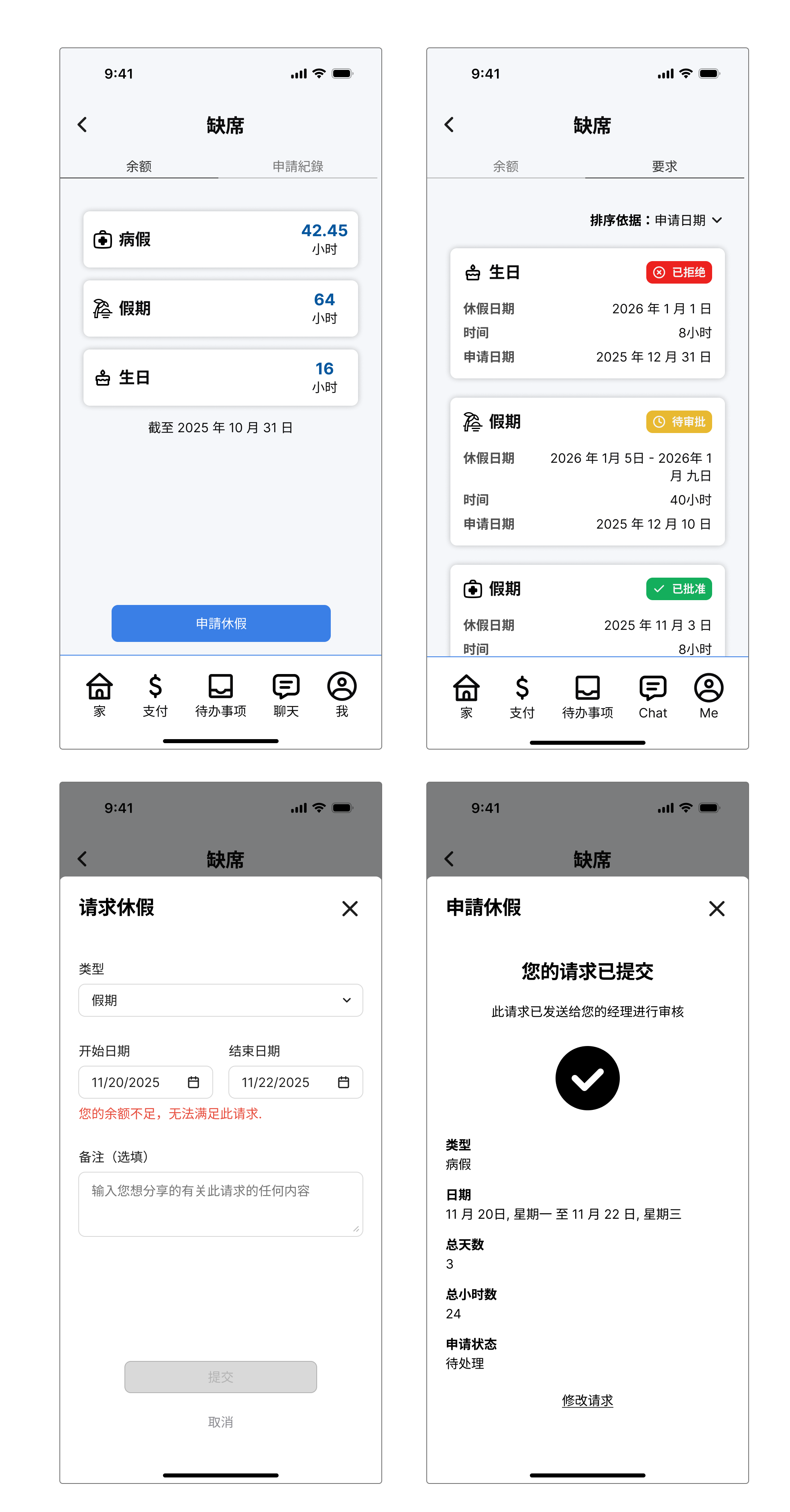
Leveraging my proficiency in Mandarin and Cantonese, I ensured that every primary action had 100% feature parity across languages, ensuring no segment of the workforce was left behind by the digital transition.
T2W is a streamlined HR mobile concept designed to empower a diverse, multi-generational workforce.
Employees at my workplace rely on an existing HR platform that is difficult to navigate, frustrating to use, and often requires HR assistance for basic tasks. For this speculative concept, I designed a reimagined HR app that addresses observed pain points and delivers a simple, accessible, and efficient experience for employees to manage their own data and PTO requests.
T2W demonstrates how 'Enterprise UX' can evolve into 'Inclusive Design.' By enhancing user independence, HR teams can focus on strategic initiatives rather than routine technical support.
Empowering low-tech users through clarity and simplicity.
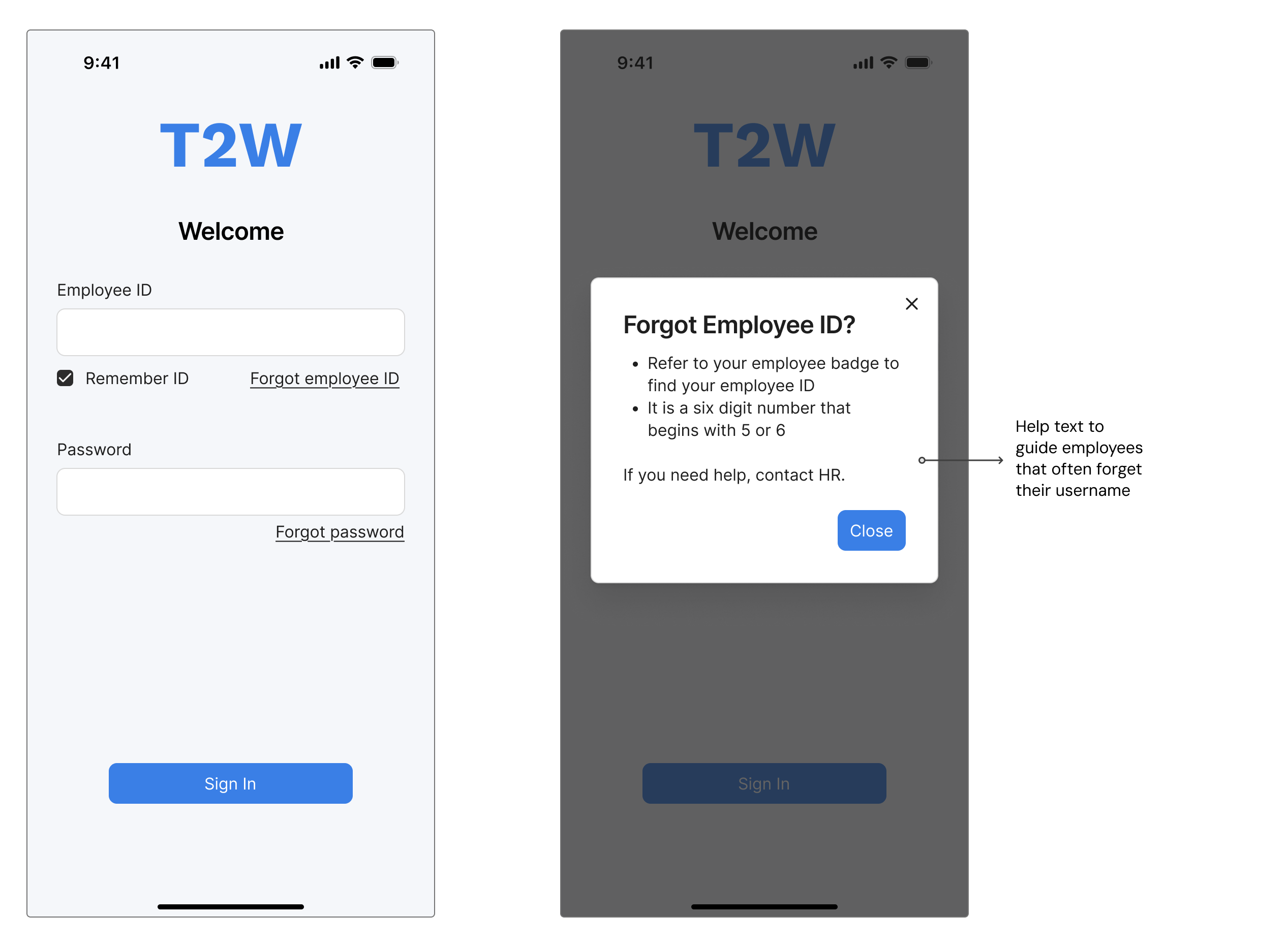
Guided Authentication: I designed an Employee ID-based login and an OTP (One-Time Password) recovery flow. To solve the reset hurdle, I added a password requirement checklist that guides the user to success on their first try.
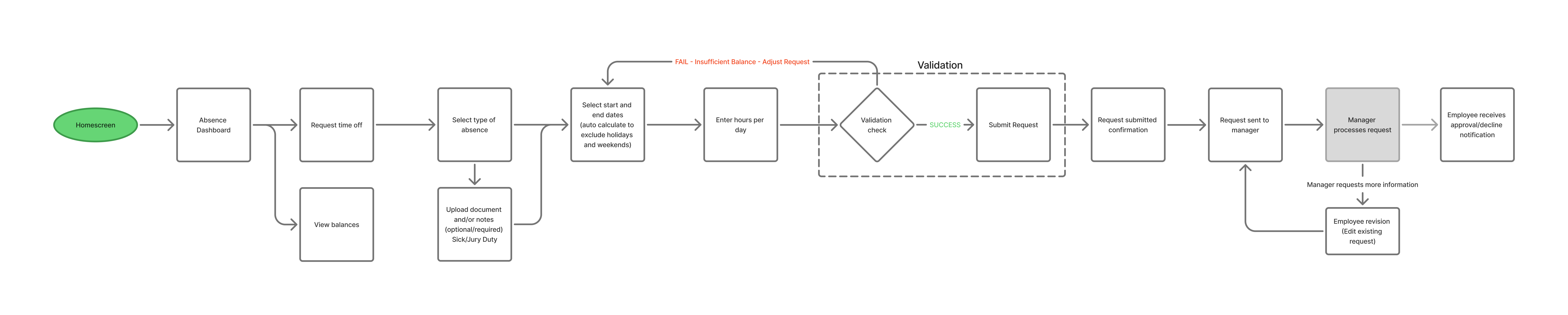
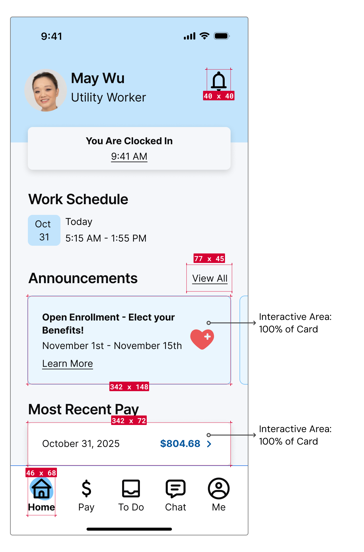
Centralized Home: The home screen features prominent and fully interactive cards for the three main actions employees take most, as well as announcements so employees don't miss important information.

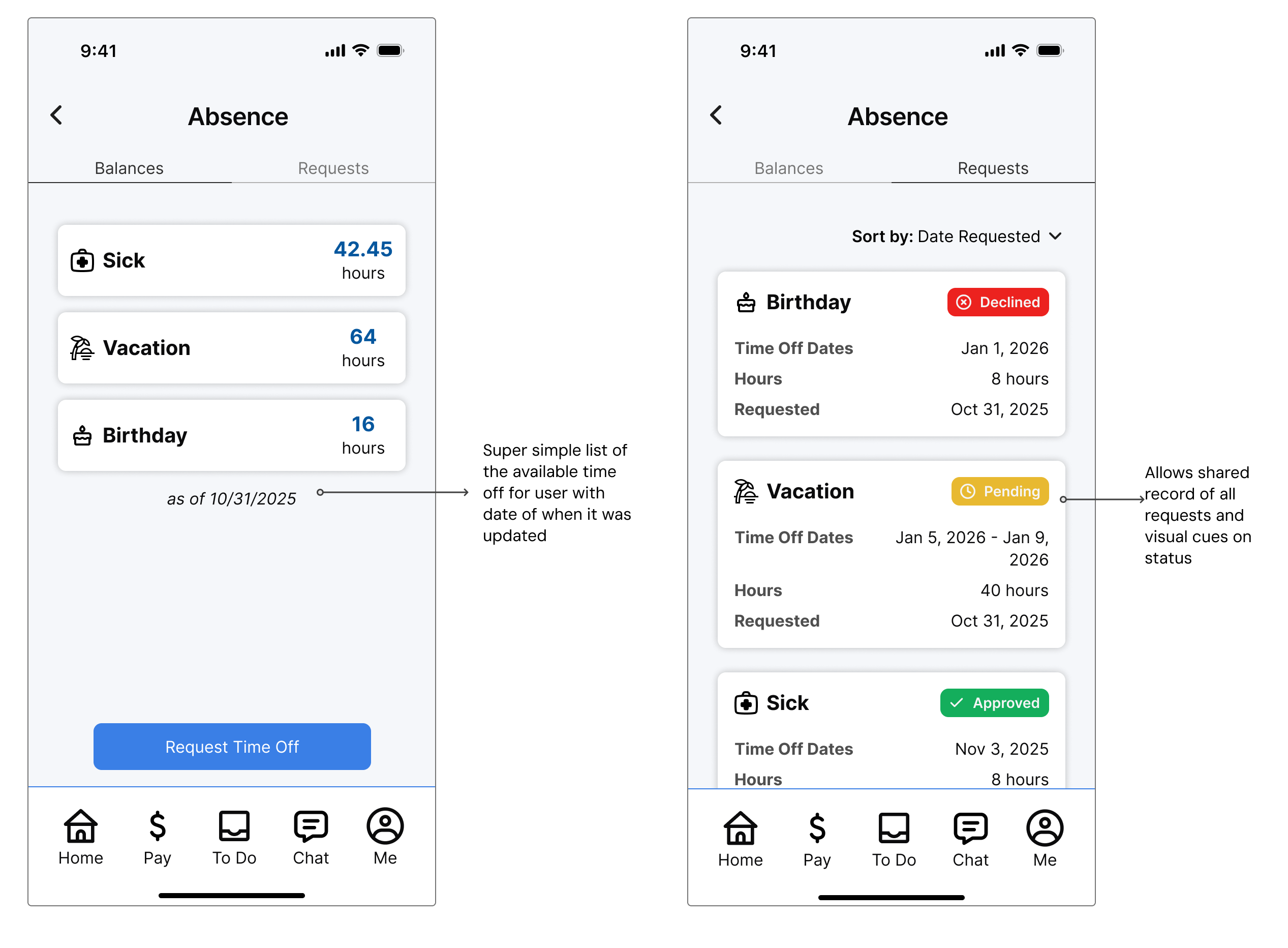
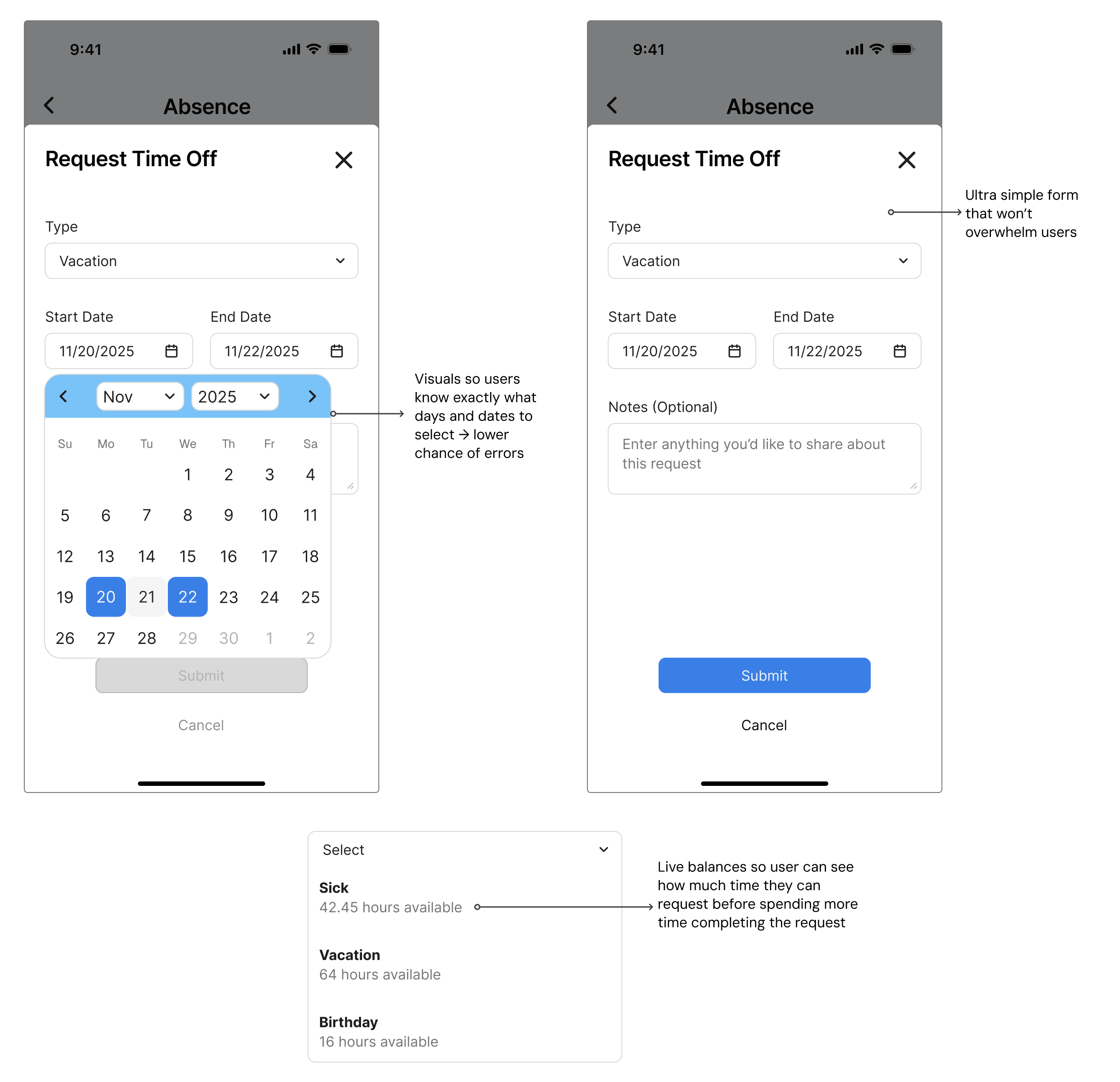
Accessible Forms: Personal information updates are no longer buried. Using large touch targets and typography, I ensured that even users with low tech-comfort can manage their data confidently.
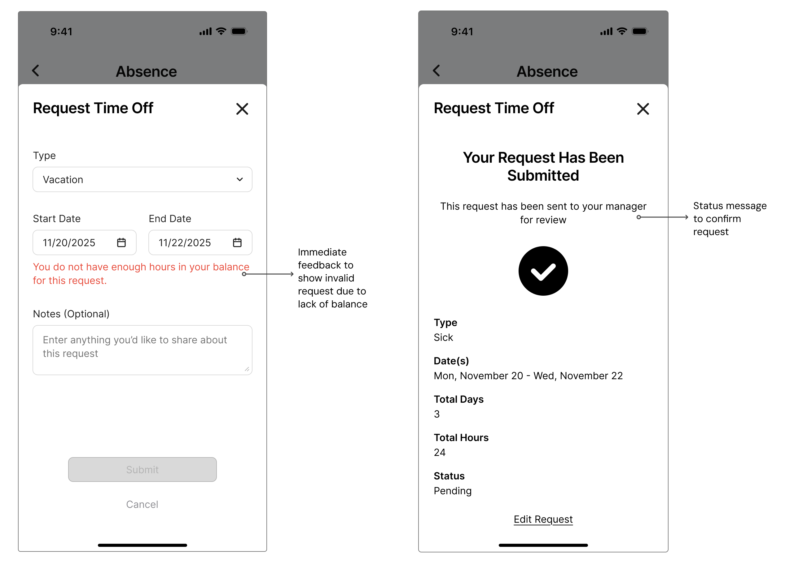
I stripped away the clutter and focused on a design that prioritizes the actions employees take most.

These metrics were chosen to directly address the accessibility and usability gaps identified during the discovery phase, each mapping to a specific pain point around HR support burden, navigation friction, and unequal feature access across language settings. The measurement methods combine task-based usability testing, employee queue monitoring, and behavioral analytics to capture both quantitative benchmarks and real-world usage patterns.
Metric 1: Task Completion Rate (TCR)
Goal: Enable low-tech and non-native English speaking employees to submit a PTO request without HR intervention.
Measurement: Use unmoderated usability testing to compare the time-on-task between the legacy system and the T2W prototype.
Metric 2: Support Ticket Volume
Goal: Reduce "Credential Reset" and "How-to" inquiries by at least 40%.
Measurement: Monitor the HR helpdesk queue for 90 days post-launch to identify trends in ticket categories addressed by the new UI.
Metric 3: Feature Adoption & Language Parity
Goal: Ensure 100% feature parity across all supported languages to eliminate the "functional divide" for non-native speakers.
Measurement: Track heatmaps and click-through rates (CTR) on the "Language Toggle" to ensure accessibility settings are being utilized effectively.
The most elegant solution is one that invisibly supports users' most basic needs.
Testing with employees! Is there enough contrast with the colors? Are the touch targets big enough?


